DAB810 ⎮Greg Holmes⎮
Friday, 11 November 2011
Thursday, 10 November 2011
Model Making
During the design of the project I started working on some models to help me understand the existing site better.
The first model I created was a 1:250 site section that cut through the center of the site. This model showed the relationship of the Agora, Transit centre and car park. The second model was a 1:200 site model that showed the overall spaces of the project, I found that this model gave me a better appreciation for the actual size of the job.
The first model I created was a 1:250 site section that cut through the center of the site. This model showed the relationship of the Agora, Transit centre and car park. The second model was a 1:200 site model that showed the overall spaces of the project, I found that this model gave me a better appreciation for the actual size of the job.
Preliminary CAD model and Plans Part 2
Looking at the terraced seating for the site, what will the materials be? what will the end use be?
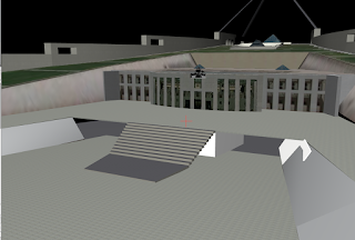
Screen shot of the CAD model looking at the overall site layout.
Starting to really resolve the final layout of the car park.
3D views of the site
Preliminary CAD model and Plans
Initial CAD modelling of the site. more massing then anything else.
Preliminary modelling of the entry tunnels to the Agora
Starting to layout the site
Plan of the existing carpark. Starting to look at how to fit the transit centre bus drop off zone into the existing structure.
Potential terraced seating for the Agora, this will be covered in the final proposal.
Exemplar project
This week i have been looking on the internet at exemplars for my style of project. The Yokohama International Port Terminal is an interesting project. with interesting shapes and materials i think that it is a great example of an engaging open space.
http://www.e-architect.co.uk/tokyo/yokohama_ferry_terminal.htm
The architect has used timber to soften the shape of the structure, i think this works really well and also creates an interesting external space for the people to use.
This project also uses terraced seating like my proposal, the timber works great to.
The ramping into the underground part of the site creates a sense of journey that you don't get with simple lifts.
Potential Materials
This week i started to look at materials for the project, Its been quite a difficult task as the materials are not only for the buildings, but for the Agora as well.
Im really keen to use some glass curtain walling for the transit center. Having the two end walls as glass will allow a sense of transparency for the space, and allow more natural light in. It will also allow a visual connection between the underground area and the Agora.
On top of the shade structures there will be solar panels that will power the lighting for the site. These panels will be able to be changed out as new technology becomes available.
Because the Agora is going to be a large open place filled with hard wearing surfaces, I would like to inject some softness and warmth into the space. For this i have chosen to use timber on some feature walls and the terraced seating.
More examples of curtain walling.
Curtain walling but with some patterning on the glass, this could be used to seperate the entry from the rest of the wall??
I really like the look of exposed concrete. I think that it will give the site an Urban feel, and tie in well with the existing materials of Parliament House.
I started looking at the supports for the glass curtain walling, I really like the look of exposed supports, though the stainless stell ones look better.
These stainless steel curtain wall supports will add a industrial feel to the curtain walling system
Agora and Cafe Design
This week i started looking at the actual Agora and how it will work within the site. I have also started looking at how the transit centre and Agora will interact.
Sketches showing some of the curtain wall details, and a possible layout for the garden beds for the site.
Sketches looking at the surrounding areas of the site and there impact on the project. How will my site be used? how will people get to the site? etc.
More spacial planning for the site and looking at what spaces will be required and there connection to each other.
Possible designs for the overhead canopy
Subscribe to:
Comments (Atom)


